Mobile First
Development with CQ Made Easy
Bruce Lefebvre / @brucelefebvre
Mobile first != RWD
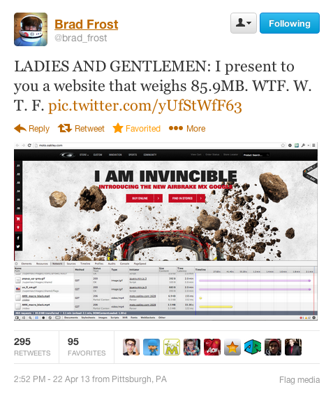
* This website is best viewed in the First WorldMat Marquis
It’s called forking, and it’s a forking nightmare from a maintenance perspective.Karen McGrane

html.touch div {
/* touch specific styles */
}

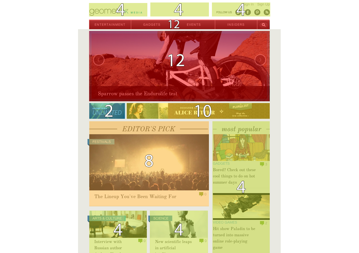
RWD
Fluid grids, flexible images, and media queries are the three technical ingredients for responsive web design.Ethan Marcotte


Fluid grids, flexible images, and media queries are the three technical ingredients for responsive web design.- Ethan Marcotte
Breakpoints

/* Large desktop */
@media (min-width: 1200px) { ... }

/* Portrait tablet to landscape and desktop */
@media (min-width: 768px) { ... }

/* Landscape phones and down */
@media (max-width: 480px) { ... }
Your project:
- Bootstrap
- Responsive Grid System
- PureCss
- 960.gs + Adapt.js
- ???
- Roll your own...
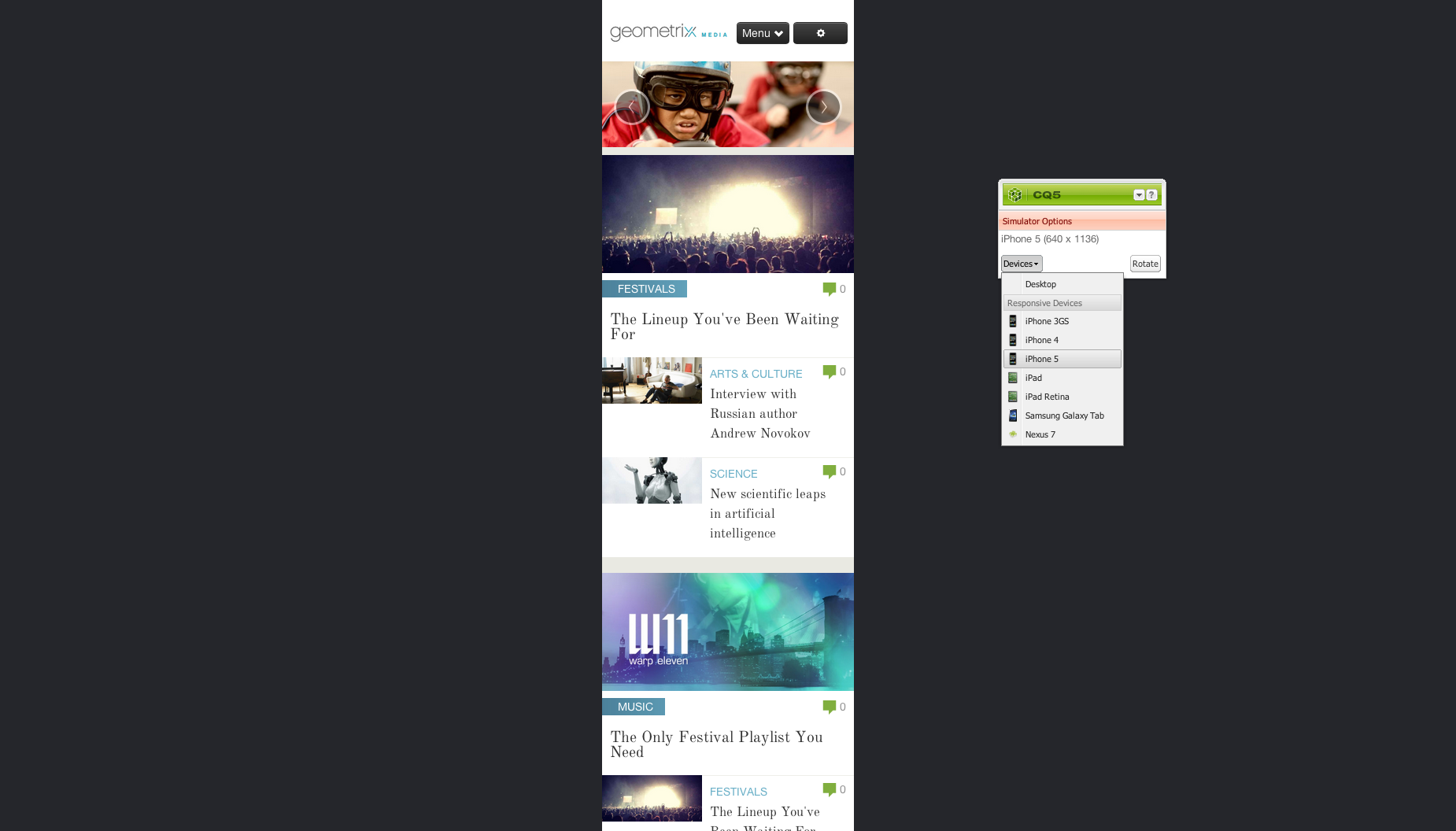
Demo
Fluid grids, flexible images, and media queries are the three technical ingredients for responsive web design.Ethan Marcotte


Fluid grids, flexible images, and media queries are the three technical ingredients for responsive web design.Ethan Marcotte
Picturefill
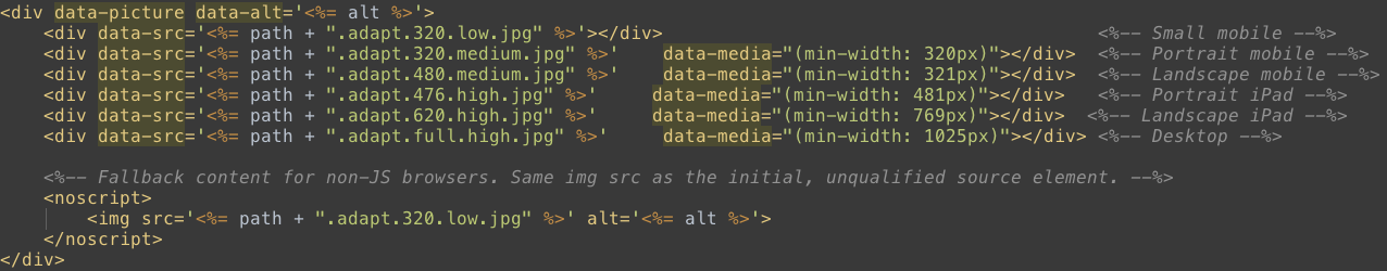
Picturefill

Picturefill

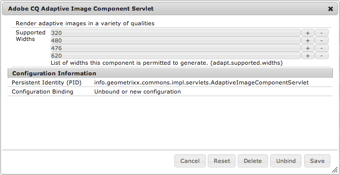
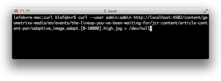
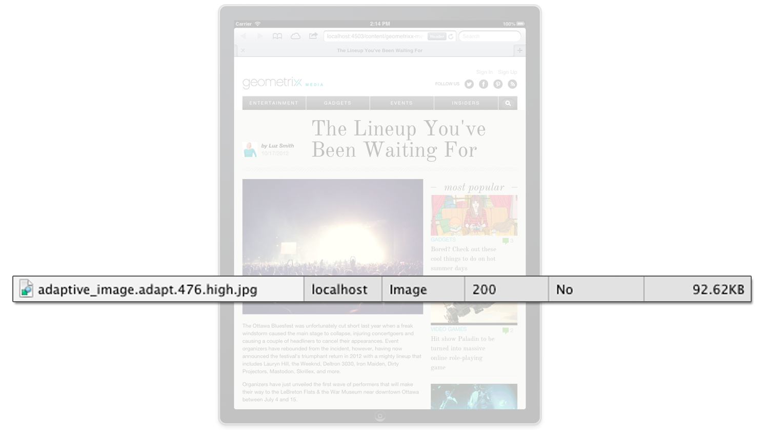
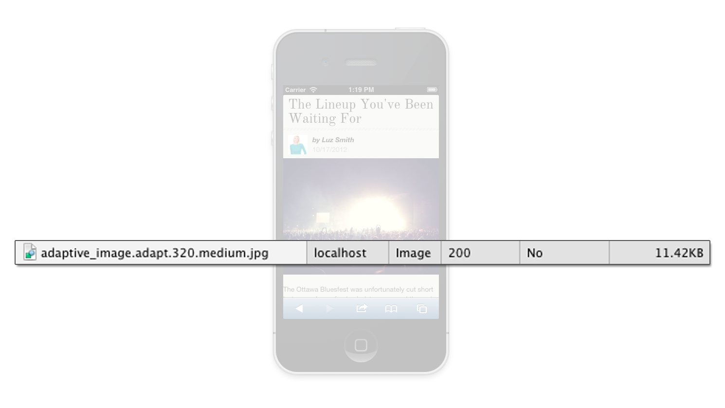
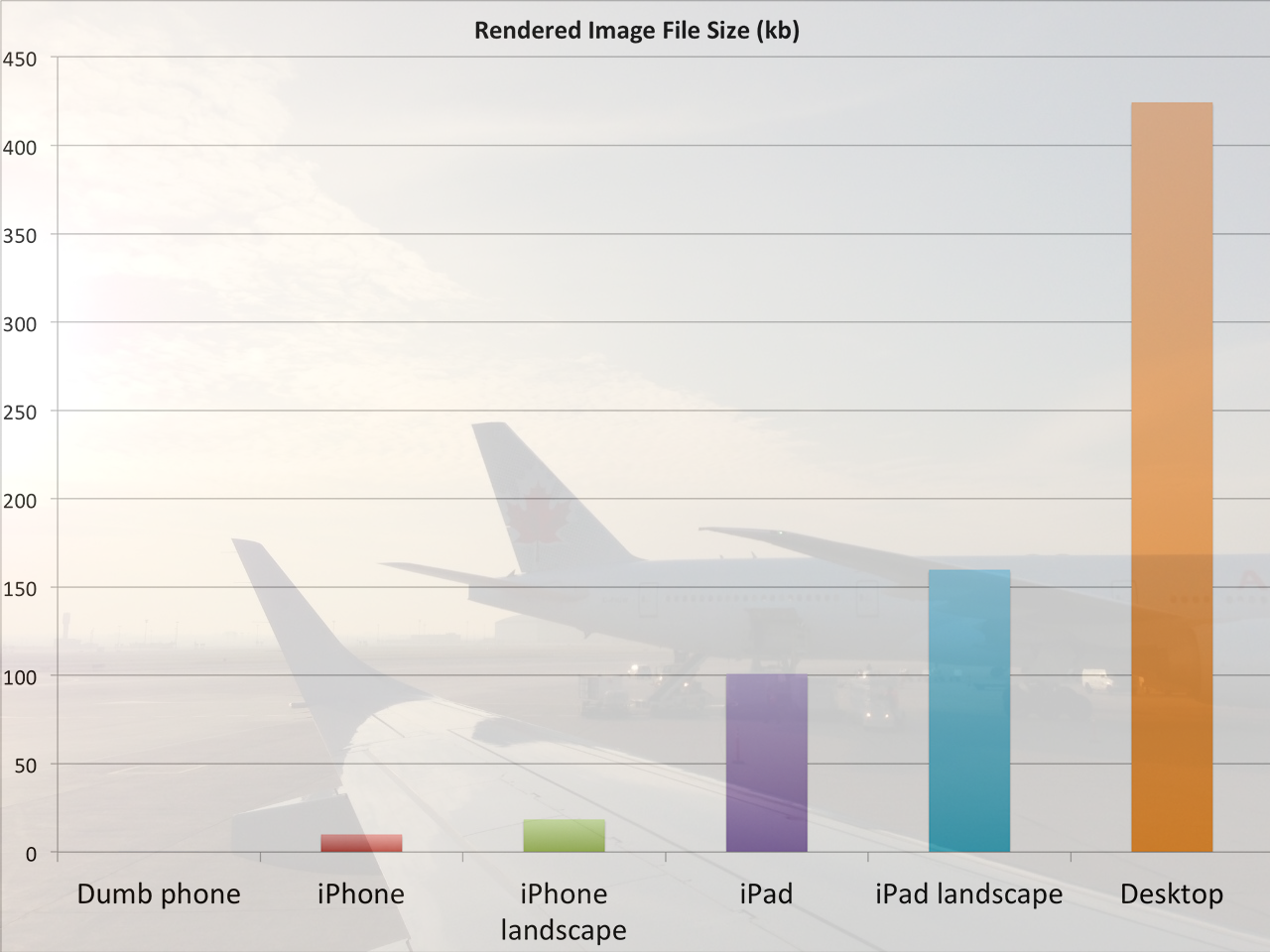
adapt.[0-10000].high.jpg
Demo
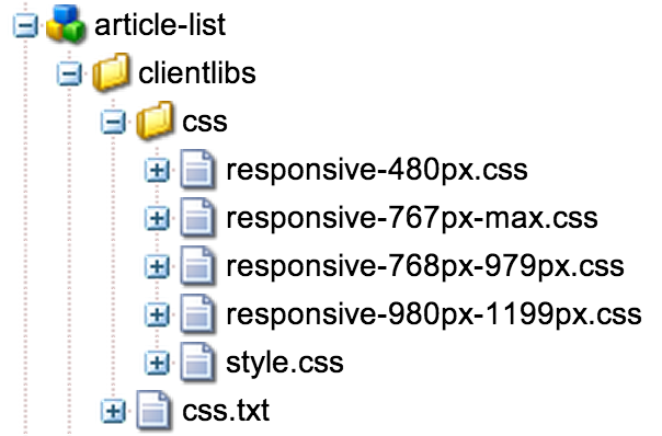
Client Libraries
Embrace the cascade.Stephanie Rieger
Demo
Fluid grids, flexible images, and media queries are the three technical ingredients for responsive web design.Ethan Marcotte
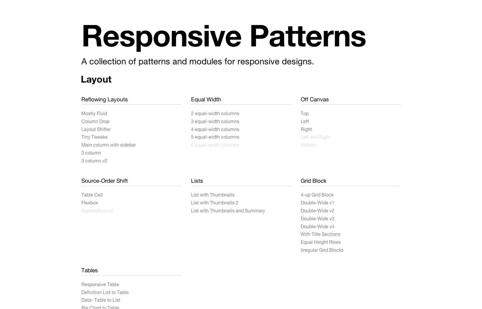
Resources
- Responsive Web Design - ETHAN MARCOTTE
- Implementing Responsive Design - TIM KADLEC
- Mobile First - LUKE WROBLEWSKI
- Adaptive Web Design - AARON GUSTAFSON
(more)
- This is Responsive - BRAD FROST
- Responsible Responsive Images - MAT MARQUIS
- Pragmatic responsive design - STEPHANIE RIEGER
- A separate mobile website: no forking way - KAREN MCGRANE
- Breaking the 1000ms Time to Glass Mobile Barrier - ILYA GRIGORIK
- Simple content package archetype - JUSTIN EDELSON
(even more)
Everyone is now trying to return the web to it's inherently fluid state. And that's perfect.Brad Frost